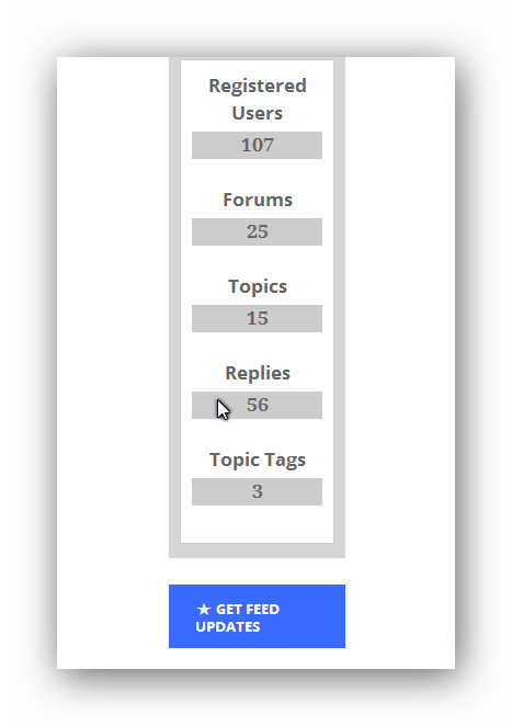
I’d say the issue was more with the widget not taking up the column space it could – rthe widget below is much wider. This is fixed usually with css rather than widget code.
Sorry but an training today or I’d take a look, perhaps rob will
Will do it later , bout to head to sleep
But yeah it always looks weird whenever that stats widget is in a sidebar , I would put the stats short code in the bottom of some templates
Thanks a lot. I’ll try to look into it some more.
ok on this i recommend just keeping the stats and label on top of each other and just make it look better, and it will stay in your tabbed widget.
heres how i got it to look on your site, by editing the css in inspect element.

are you okay with that or do you still want to go to the stats beside label option.
That looks perfect but can you also help me hide category tags and forums number ?
ok heres the code
.widget_display_stats  dt, .widget_display_stats  dd {
	text-align: center;
}

.widget_display_stats dd {
	background:#CCC;
	padding: 5px;
	margin-top: 5px;
	color: #222;
}
category tags and forums number
if your talking about whats in the stats widget
just copy content-statistics.php into your child theme if you havent already.
and edit the file and remove what you want.
This is weird, nothing changed.
the css or content-statistics.php
if its the css ,
test to see if you need to add more classes to the code so it could with the tab widget,
test it by seeing if another stats widget has the css if you place it alone in the sidebar by itself in the tab widget
