The default styling is subject to change over time, and there were some tweaks in all of the 2.6 releases so far. It’s hard to know exactly what’s causing it, but some custom CSS on your end to clear whatever is floating around should snap it back into place.
thank you for the quick reply
We are a team of admins, but no programmers.
how do we get this “custom css” to implement, please?
Thanks,
Kevin-Stephen
@admin7 of the Scaffies team
In your browser if you press F12 it will bring up the development console, you should be able to use the inspector and picker in this to highlight which CSS is active on certain elements on your site. You should also be able to test making modifications in here which are only temporary but will show you what css changes will look like.
thanks for the tip @snorklebum !
Feedback: F12 development console / inspector has not provided any useful results 🙁
link to an example on your site please
@robin-w Thanks for your response!
The site is a membership-only site, and not public. If you would be so kind to take a look at it, can we give you a guest account?
If so, where do we best send login credentials to? (I see no private reply option here)
Should we send it to your publicly listed email address off your profile here?
Thanks! … and done, incl separate email with more infos.
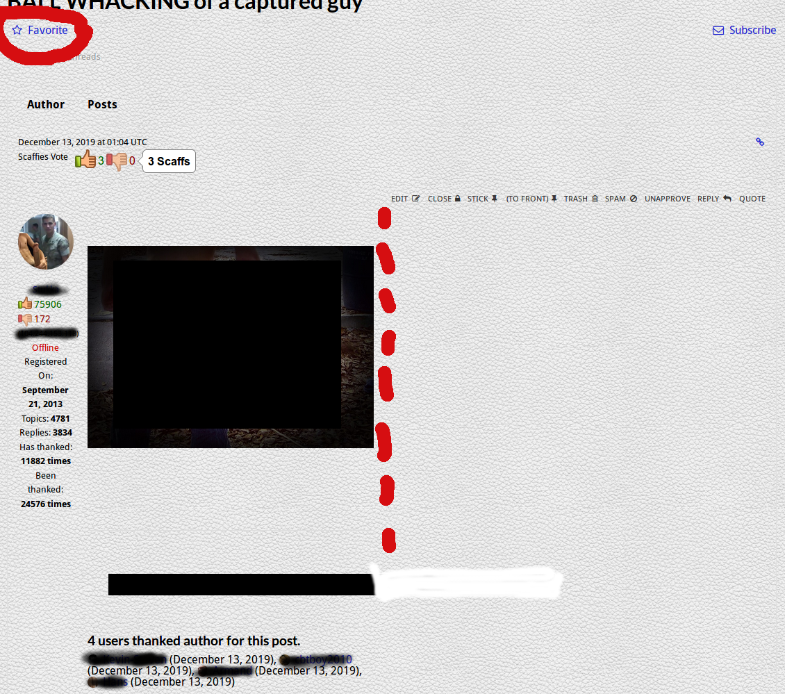
Here is maybe a better example – the matter remains unresolved.
after the 2.6.2/2.6.3 upgrade these issues came up:
– the “Favorite” option is now on the left, instead of being in front of the “Subscribe” option on the right
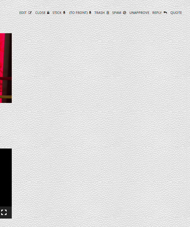
– the content of the topic is now limited to the space until the options (Edit, CLose, Stick, etc) start, reducing the content with to about 50% for admins (as shown below), and reduced by about 20% for regular members with fewer options.
The high-resolution picture in the example below should fill in the entire content area to its full width (but only shows half-size).
Since this started with the upgrade, it is reasonable to assume it is directly related to bbpress.
A solution would be really (!) helpful.
We use the DynamiX theme (since over 6 years), now in version 5.
Wordpress and all plugins in their current versions.
Thanks!!

If we can’t see your forums, we can’t debug them.
You’ll need to make someone an account so they can login and browse around and see what you see. Screenshots simply aren’t enough to help anyone. We’ve gotta see the code, inspect it, and then recommend changes to improve it.
Hello John,
of course 🙂
a little above in the thread moderator @robin-w asked for a guest account, and we promptly provided him with one. Subsequently he logged in, looked at it, and suggested a custom CSS, which we implremented. But it only made a line at the bottom of each topic post disappear, and did not fix the issue. This is why it is still open.
Would you like a separate guest account for yourself or someone else?
We greatly appreciate your help!

